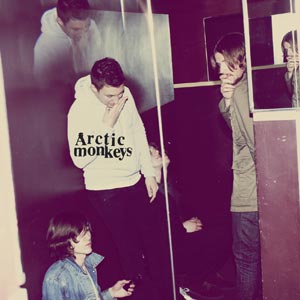
Humbug - Arctic Monkeys
 I like this alubm because it shows the band personel. This is a possibility for our digipack to show images of us at brighton therefore the audience can identify with us more. The image shows a more relaxed natural look at the band. The colours have been edited to give it a more retro feel. I like how they have put Arctic monkeys on the white jump to make it stand out. The clothes such as the denim jacket highlight that they are a inidie band.
  It is easy to understand that front and back cover are both simplistic. The font style of the title 'Arctic Monkeys' stands out on the page and makes it look disnictive. The faided colour and plain empty design shows the simplstic theme of the album cover. The faided background colour, though, gives a vintage feel to it as well.
The disc looks burnt at the edges to give it vintage but also gritty look. This again highlights their exclusion from the mainstream and into the indie rock genre. It has been a occuring idea that they try to present their band name. It has seen clearly on the front cover, it is the biggest font size and different font style on the back cover and it is now stylized as AM on the disc. This shows the importance of the bands name so they can identify with fans and less significance with the album name.
No comments:
Post a Comment