Comedown machine - The Strokes
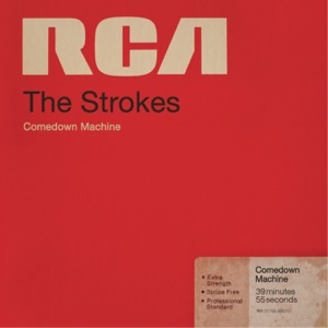 The font for 'RCA' particularly stands out for me as it is distinct and emphasises they are a indie band. The fact that the title of the album 'Comedown Machine' is in very small text size also emphasises this distinctness because in mainstream bands the album title would be the stand out text.
 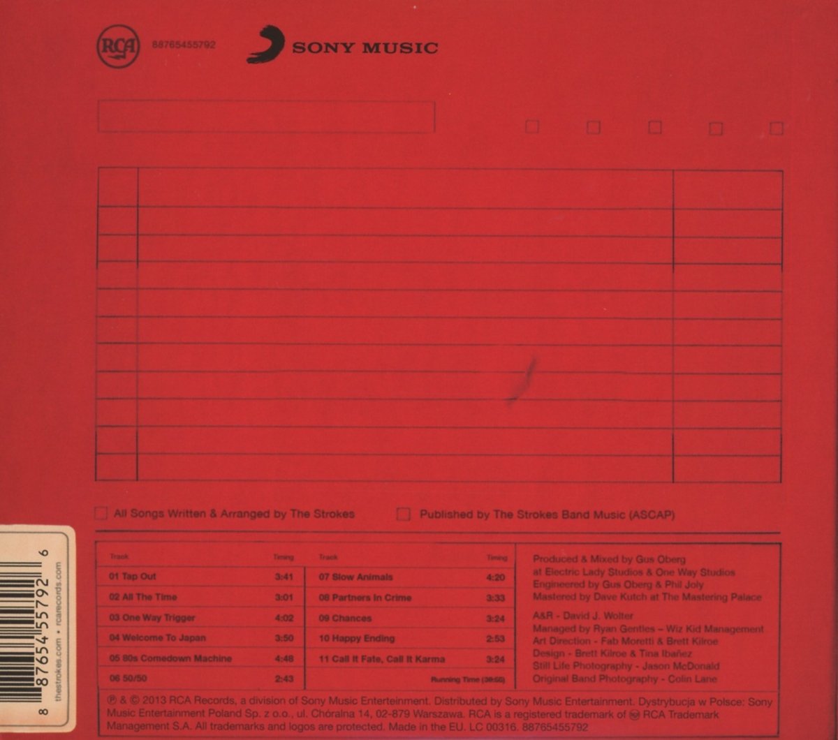 The way they have a laid out a blanked out grid is very interesting. This highlights the bands grittiness and indie roots.
This album is inspiration because the font style on the front cover is very appealing to us because we have also chosen the indie rock genre. The overall design of the album emphasises a disincitive rock album which we want to portray in our digipack.
No comments:
Post a Comment