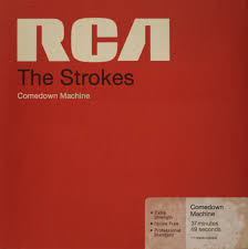


The colours of the website seem to resemble the front cover of their
newest alum 'Comedown Machine'.

The events tab is laid out very well with the 'Next Show' at the top and then 'Upcoming Events' are below. I like the way there are separate columns for 'Date', 'City' and 'venue'.

Their music tab only consists of albums and only a few singles which isn't as extensive as The Arctic Monkeys website.

The photos tab allows fans to upload their photos. This is way to connect with their fans.
 The community page is laid out very well with individual columns for 'Topics' and 'Posts'.
The 'Store' page has exclusive items and is stands out by the light blue background.

They are most selling t-shirt and maybe indicates they targeting a young audience of 16-30.
The T-shirts are put on a grey background to make them stand out.
The fact that is all T-shirts suggests they are indie rock band and not trying to broaden their merchandise items which a lot of mainstream bands do.
I really like the red background personally because it appeals to me but some would say it is a bit plain and simplistic. Like the Arctic Monkeys, Indie Rock bands don't go for flashy websites with lots of colour which suggests they not trying to conform to more mainstream bands. It seems rock band website never change their background colour when going on to a new page as well.
.png)


No comments:
Post a Comment