 The black and white colour and the image of urban housing emphasies grittiness and refelcts the indie genre. The image itself of the lower class housing emphasies the theme of the album . Also, the way the text is postioned in the top left hand corner also reflects their genre as it is distinctive. But it is also to do with the fact they want to concentrate more on the image then the band name or albumtitle. The font used for the text is very different to give a sense of uniquness to the band. It seems the band's name is again more important than the title of the album as 'Arctic Monkeys' is of a bigger font size to 'Favourite Worst Nightmare'.
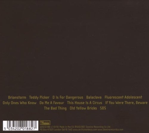
Again like Humbug the back cover is very plain with the tracklisting in a small font size and placed near the bottom. Maybe the band is trying to be more recongisble and indentifable with their back cover layouts.
No comments:
Post a Comment