Showing posts with label Website. Show all posts
Showing posts with label Website. Show all posts
Sunday, 29 March 2015

Saturday, 28 March 2015
Store page

.png)
.png)

Friday, 27 March 2015
Contact page

Thursday, 26 March 2015
Music and album page

- Most rock bands have this page to present an archive of previous albums and singles they have made.
- As this is our first album this page is quite small but I put a few things on it such as the full track list of the album, another picture of the front cover to promote the album and a link to buy the album. Also when the viewer comes onto this page the song 'someday' automatically plays on the audio device.
Wednesday, 25 March 2015
Gallery page

- Photos increases our star image of the band being a whole group.
- I put thumbnail type slide to make it easier to navigate throught photos.
- I felt brighton gallery was important because it is related our music video and the music videos themes.
- I put a studio gallery because this is illustrates our live performance we did.
- I put amusing videos such as a clip of us going on the dodgems because the our audience demographic will find this amusing.
Gig dates page

Tuesday, 24 March 2015
News section
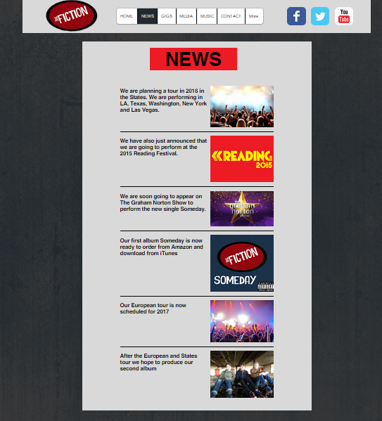
- News section appears in most rock band websites. This page is normally just for the fans to keep up to date with the band's activity.
Home page

- I thought it was important to have photo of the band members us on the home page so that we become recognisble to our fans. I colourised the photo because it gives an old feel to it like our super 8 footage in the music video.
- I put a news and upcoming gigs mini section on the homepage because other rock bands tend todo this and also felt it was important sections so it should be on the first page of the wesbite.
- I put the social media tabs on the navigation bar so that they appear on each page. This emphasised the importance of social media as a way of interacting with fans and growing the bands fan base.
- I also put the logo on the navigation bar to emphasise the way the logo can be a way of identifying with the band.
- I put a slideshow of some merchandise products on the homepage as this might appeal to our demograhic audience.
- I put an audio device on the homepage so that it gives the viewer an opportunity to listen to see if they like it or not.
- The music video was put on their because it showcases our talent of performing live and the viewers get an idea of what the bands persona is like.
Friday, 13 March 2015
Initial idea
My first idea for a website is to have a dark colored background because most of rock band websites tend to choose dark colors to illustrate their genre. I will probably go for a dark blue background with white text. Therefore the text stands out and it is easy and clear to read. I will most certainly have designed T-shirts for my merchandise section. I will also present the music video and song on the front page to promote our content to the viewers. There will also be a section for the photo album we have created. The best photos will be on the front page as well for promotion.
Thursday, 12 March 2015
Mallory Knox website
 Again the colours are mostly black which reflects what most indie rock bands have as their primary colour for websites. However they do add a bit of colour such as 'Asymmetry' is in yellow to make it stand out as 'Asymmetry' is the title of their new album. They have added colour to 'official merch' link to emphasise merchandise is important to them.

 There social media link also stands out as well to suggest they put a significance on social media and trying to connect with fans.
This is all one page so they don't advertise photo albums or previous singles or albums like other rock bands do such as The |Arctic Monkeys. However they advertise necessary stuff such as tour dates, merchandise, music videos and latest album and the design of the website is not as plain as other websites in terms of colour.
The merchandise has more of a wider range than other websites I have researched. Other than the necessary t-shirt they have hats, wristbands and vests. This again emphasises they are trying to target a young audience.


I think the design of the store page is very appealing due to the background colour and the band logo.
 They have also put under each item of merchandise a button for Twitter and Facebook.

Again, like Royal Blood they have imbeded Facebook and Youtube tabs on their store pages.
The Strokes website
.png)


The colours of the website seem to resemble the front cover of their
newest alum 'Comedown Machine'.

The events tab is laid out very well with the 'Next Show' at the top and then 'Upcoming Events' are below. I like the way there are separate columns for 'Date', 'City' and 'venue'.

Their music tab only consists of albums and only a few singles which isn't as extensive as The Arctic Monkeys website.

The photos tab allows fans to upload their photos. This is way to connect with their fans.
 The community page is laid out very well with individual columns for 'Topics' and 'Posts'.
The 'Store' page has exclusive items and is stands out by the light blue background.


They are most selling t-shirt and maybe indicates they targeting a young audience of 16-30.

The T-shirts are put on a grey background to make them stand out.
The fact that is all T-shirts suggests they are indie rock band and not trying to broaden their merchandise items which a lot of mainstream bands do.
I really like the red background personally because it appeals to me but some would say it is a bit plain and simplistic. Like the Arctic Monkeys, Indie Rock bands don't go for flashy websites with lots of colour which suggests they not trying to conform to more mainstream bands. It seems rock band website never change their background colour when going on to a new page as well.
Wednesday, 11 March 2015
Royal Blood website
 The first thing that stood out for me was the websites colours which were plain black and the text was white. This is a indication that this is a website about a rock band. Another indication for a rock band
is the font they use for the band title.


 The gigs page is very easy and clear. The gigs that are sold out are stated as 'sold out' with a faded colour compared to 'buy tickets which is in white text and underlined to make it stand out to emphasise it is still on sale.


Like other websites I have chose they have gone with a simple and easy layout with the photos in the centre of the page and other photo albums down the right hand side.
Like other rock band websites they have used a website to advertise their archive of albums, singles and music video.


I like how on the tabs bar they presented their social media icons. As they relatively new band they want to try and connect with new fans. They have a advertised a wide range such as YouTube and Instagram.
On their store page they have a twitter feed down the side. This emphasises their need to connect with the general public.
Again most of merchandise is T-shirts. They are again trying to target younger audience of 16-30 year olds who would buy T-shirts. It is generally necessary for a rock band to make T-shirts for merchandising because of their target audience.
The T-shirts are not with very vibrant colours which emphasise the genre they belong to. Most of the T-shirts are either black or white.
The design for the merchandise page is the same as the website black and white which are very simplistic colours.
 They have used a marketing campaign of getting a free download when you sign up for mail list. This is to try and grow there fan base.
 Overall the website reflects their image as a rock band but the website is a bit plain and empty. However this should improve once the band grows over the next few years.
Subscribe to:
Posts (Atom)